5 Signs You Need A New Dental Website
You just don’t understand! You feel like you have the best dental website that your best friend’s brother created for you five years ago. It has such nice colors and a variety of images. Then why aren’t patients trying to reach you about scheduling an appointment? I hate to break it it to you, but you need a new dental website! Here’s how we can tell.
1. Your dental website visitors don’t stand a chance
Go on your website and take a look at how many opportunities you actually give your visitors to convert (not counting the contact page). The reality is, you may not give your website visitors nearly enough chances to convert even if they wanted to. Make conversion easy for them. Think about including a temporary popup when a user has been on you site for longer than a certain period of time, make sure there is at least one call-to-action on every page, and keep your phone number visible in multiple locations. Also, make sure your phone number is enabled for easy click-to-call on mobile devices.
2. Your dental website wasn’t built with visitors in mind
Does your website meet the needs of your visitors? Because if it doesn’t, there is no possible opportunity for conversion. In fact, this means your users will not have any interest from the start. To find out which pages your visitors find appealing and which ones they don’t, you must examine your analytics. Warning signs of a page unable to convert are:
- Little time spent on the page – This shows that your user spent very little to no time on a specific page.
- High bounce rate – This means the visitor looked at only the page they landed on from their search.
- High exit rates – The exit rate includes the last page the viewer looked at on the site before leaving.
Each one of these signs predicts how your audience feels about your website. However, they all come back full circle and symbolize a lack of interest. It’s your job to figure out where the lack of interest comes from. Try A/B testing by changing one significant thing at a time to see if that helps your problem at all.
- Is your website’s loading time too long? – According to Google, your mobile website should load in under 3 seconds or you’ll lose 40% of people who visit. To test your website speed visit https://tools.pingdom.com/
- Is your website aesthetic appealing? – Beauty may not always mean everything, but aesthetic does. Your dental office website design should be visually pleasing for your visitors. It should also align with the message you’re trying to put out. Does your website convey your brand?
- Do you have enough value for your visitors? – Consider what you’re offering. If your 10 percent off discount isn’t working, try offering a free consultation. People have to feel what you’re offering them equals what they are offering you.
Testing each thing one at a time allows you to figure out where the problem lies and if you need a new dental website.
3. Always think functionality
Over half of your visitors use their phones to view your website. People are impatient and want fast answers to their questions. Because of this quick mentality, they often search from their phone. If your mobile dental website isn’t user friendly, forget about it, because someone else’s is. Your website should have a responsive design. This means it should look just as good on someone’s mobile device as it does on their desktop.
There are many other structural issues which make it clear that visitors weren’t considered when your website was built. For example, information should be easy to search and easy to find. If it takes someone too long to find what they are looking for, they’ll go elsewhere.

4. You’re annoying them
It’s easy to go overboard, we’ve all done it. But, sometimes too much conversion is just TOO MUCH conversion. Yes, there is a such thing. Think about it, how would you feel if all your patients came in all at once. They all are standing in your waiting room and screaming, “pick me, pick me!” until you pick someone to sit in your chair next. A little overwhelming, right? The same goes for conversion. You don’t need a pop-up every two seconds.
You should also remember that people like things that are visual. That means a website with only text can send a visitor running quicker than you can say conversion. Make sure to include images and interactive content to get and keep their attention. Add a practice video to keep their attention. They’ll love it! Give your visitors a reason to want to stay for longer than 30 seconds, so they can see what you have to offer them.
5. You didn’t consider your dental website copy
Your website is only as good as its copy. You shouldn’t drown your website with text just to fill the space. Instead be precise and thoughtful with your words, answering the questions you know your dental patients want answered. Be sure to use simple terminology to ensure you don’t overwhelm your readers. For example, dental prophylaxis makes sense to you, but your patients don’t understand it, so stick to the simple term, dental cleaning. Also consider your target audience. Pediatric practice? Speak to the moms and dads out there! Implant focused? It’s likely your audience is a bit older and more affluent, so provide more in depth education on the topic. Thinking in this manner will help you to write with your patients in mind. And if this just seems too time consuming or not up your alley, hire a professional dental copywriter or dental website design company who does this all day every day to get it right the first time.
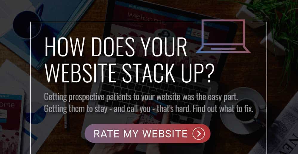
Hopefully, we have you thinking deeper about your website now! There is more to a new dental website than pretty colors and vibrant pictures. Wondering where to begin?
Test your website against our free website conversion scorecard.