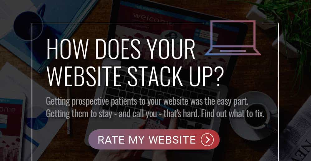
How to Create a Dental Website Patients Will Love
Is your dental website design a dud? These five steps are all you need to go from dental website disappointment to satisfaction and success. In this week’s Wednesday Wisdom, Janaya shows you five super simple things you can to do to actually have a dental website that patients will love and remember instead of one that makes them click on and click right off.
She’ll tell you about:
1) Using authentic, personal content to accurately represent your brand and your personality.
2) Making sure your dental website is optimized for mobile use (seems like a no-brainer, right?).
3) The many benefits of having an easily digestible content layout.
4) Having your dental website set up so there’s less ‘clickability’ needed (AKA easy to navigate).
5) Telling a story with engaging content that wows and woos your readers instead of sending them to another site.
TRANSCRIPTION
Janaya: 00:00 Hi, everyone. My name is Janaya, a graphic designer here at GPM. Today on our Wednesday Wisdom, I’m here to talk to you about a few design tips that you can utilize to create a professional looking and performing website.
Step #1: Use authentic, personal content
Janaya: 00:14 Step number one. Be you. Whatever your brand is, whatever your tone is, whatever you’re trying to get the message across to be, be you. If that means that you want to be fun and upbeat and charming, go ahead. If that means that you’re more professional, that you’re trying to be a little bit more reserved, do that. Do whatever you want to do, just make sure you do it well.
Step #2: Build a mobile responsive dental website
Janaya: 00:35 Number two. Keep your mobile users in mind. It’s 2018, people. Over 70% of your users, whether you like it or not, are coming from the mobile device, whether it’s their iPad, their iPhone, their Samsung. Whatever it is, they’re coming to it from their hands. They want to make sure that whatever they’re seeing is a good representation of the same message that they’re going to see via a laptop or a computer as well.
Step #3: Use visually digestible content layouts
Janaya: 00:58 Step number three. Create easy to digest content. Focus on one message at a time and really nail that down before moving on to the next. Consider visual hierarchy with your font sizes, your colors, photos, textures, you name it. Make it pretty, but above all make sure your audience knows exactly what they’re supposed to be greeting and when.
Step #4: Limit the number of clicks needed to reach a page
Janaya: 01:16 Step number four. Less is more. If you can provide your users with minimal clicks to get to the information that they’re searching for, you’re guaranteed to get better retention results. Basic things like making sure you’re utilizing a sticky navigation and easy to read font, dropdown for your menu, contact information at both the top and bottom of your page, so no matter where the user is they can always find you are all parts that will make your user feel more comfortable and at ease while trying to find the information that they came for.
Step #5: Tell a story on your dental website
Janaya: 01:45 Our last point, number five. Storytelling. Tell a story that demands attention. It’s not all about the fancy bells and whistles or the oohs and the ahs that will captivate your audience nor is it the functionality really. The copy you utilize on your dental website can really play a big role in whether or not your audience stays or they go. If they’re board, they’re probably going to go really quickly. If you’re creating content and creating copy that’s really engaging that makes them want to and to crave more, they’re going to keep scrolling. They’re going to keep seeing what you have to offer and really, that’s what we want. We want them to spend more time with you on your website to learn as much about your business as possible.
Janaya: 02:24 That’s all I have for you guys. Tune in next week for another episode of Wednesday Wisdom. See you later.